[youtube=http://youtu.be/7hhrTPP2zV0?t=4s]
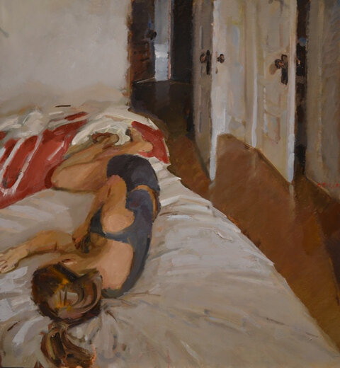
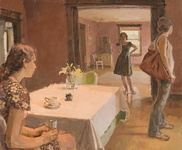
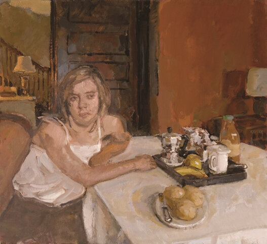
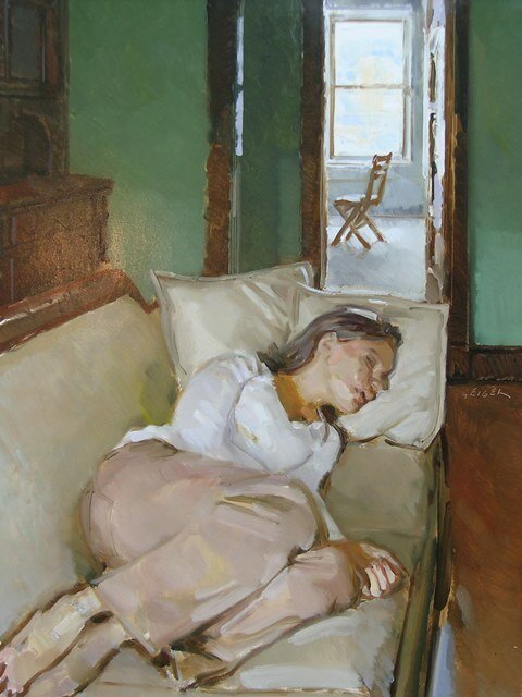
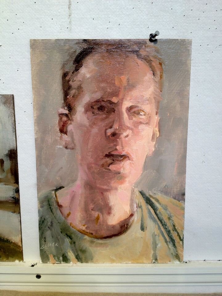
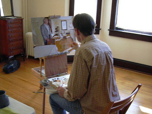
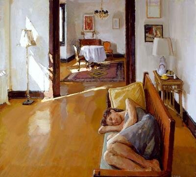
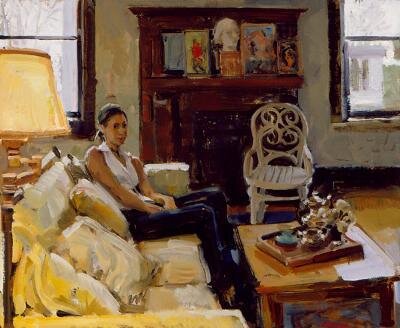
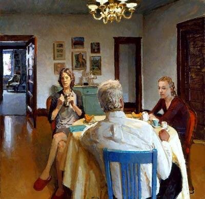
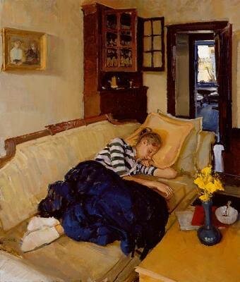
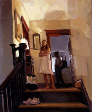
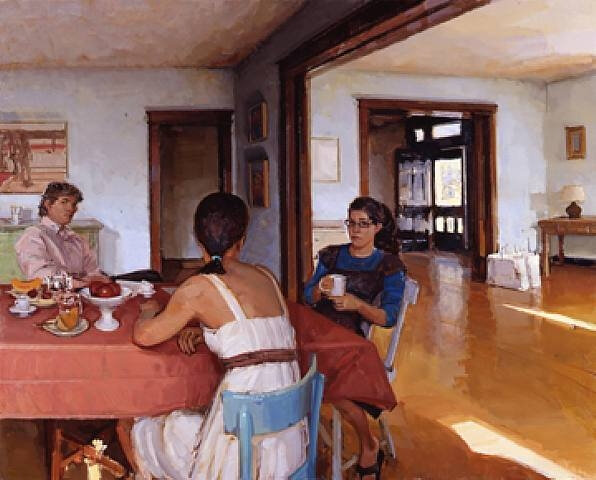
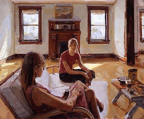
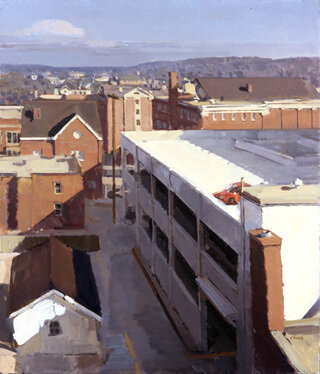
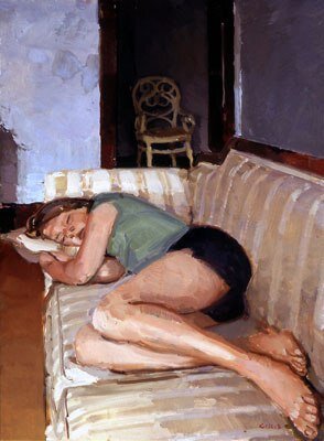
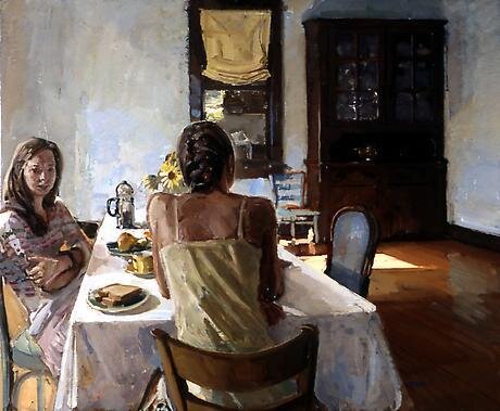
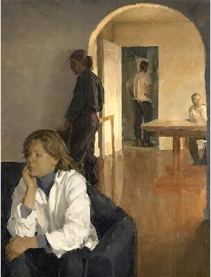
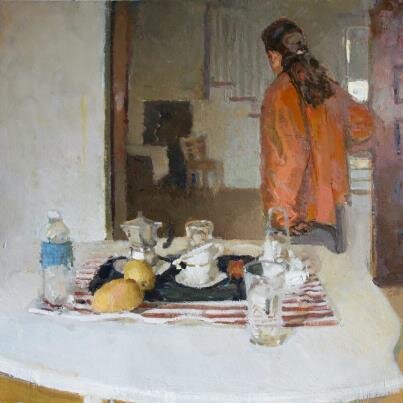
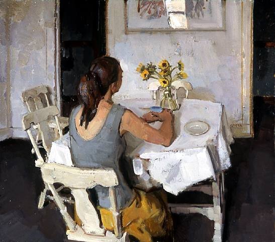
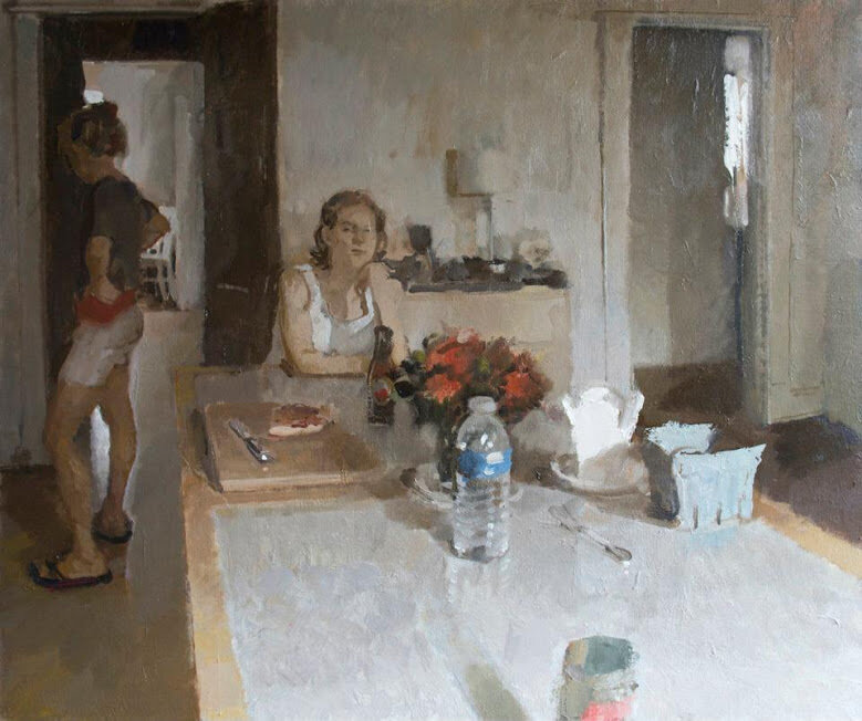
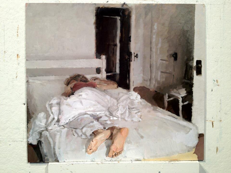
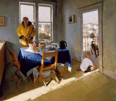
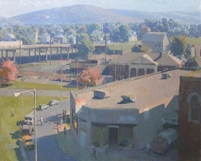
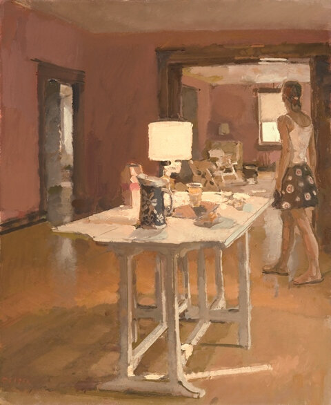
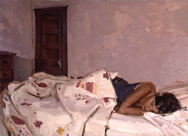
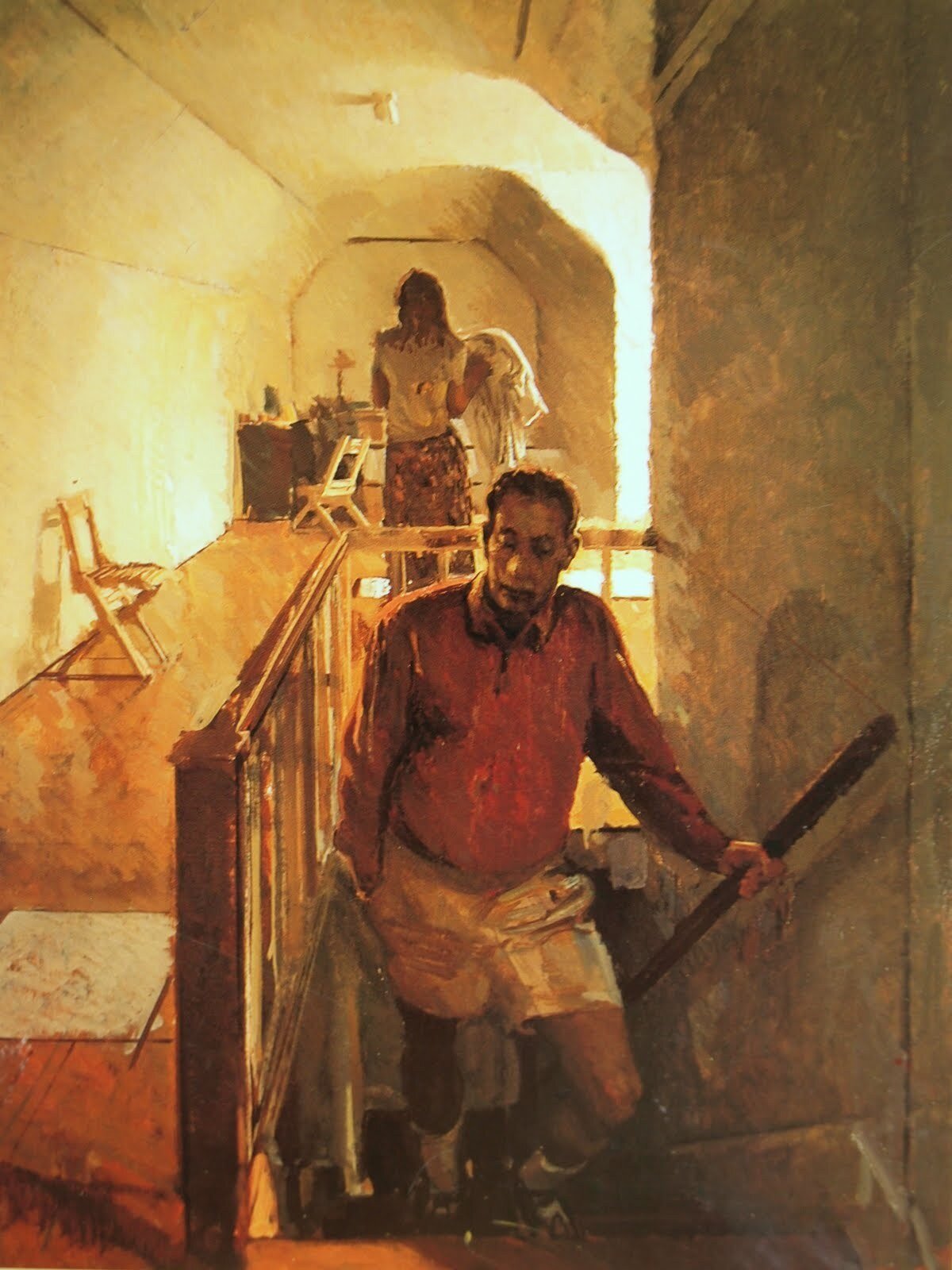
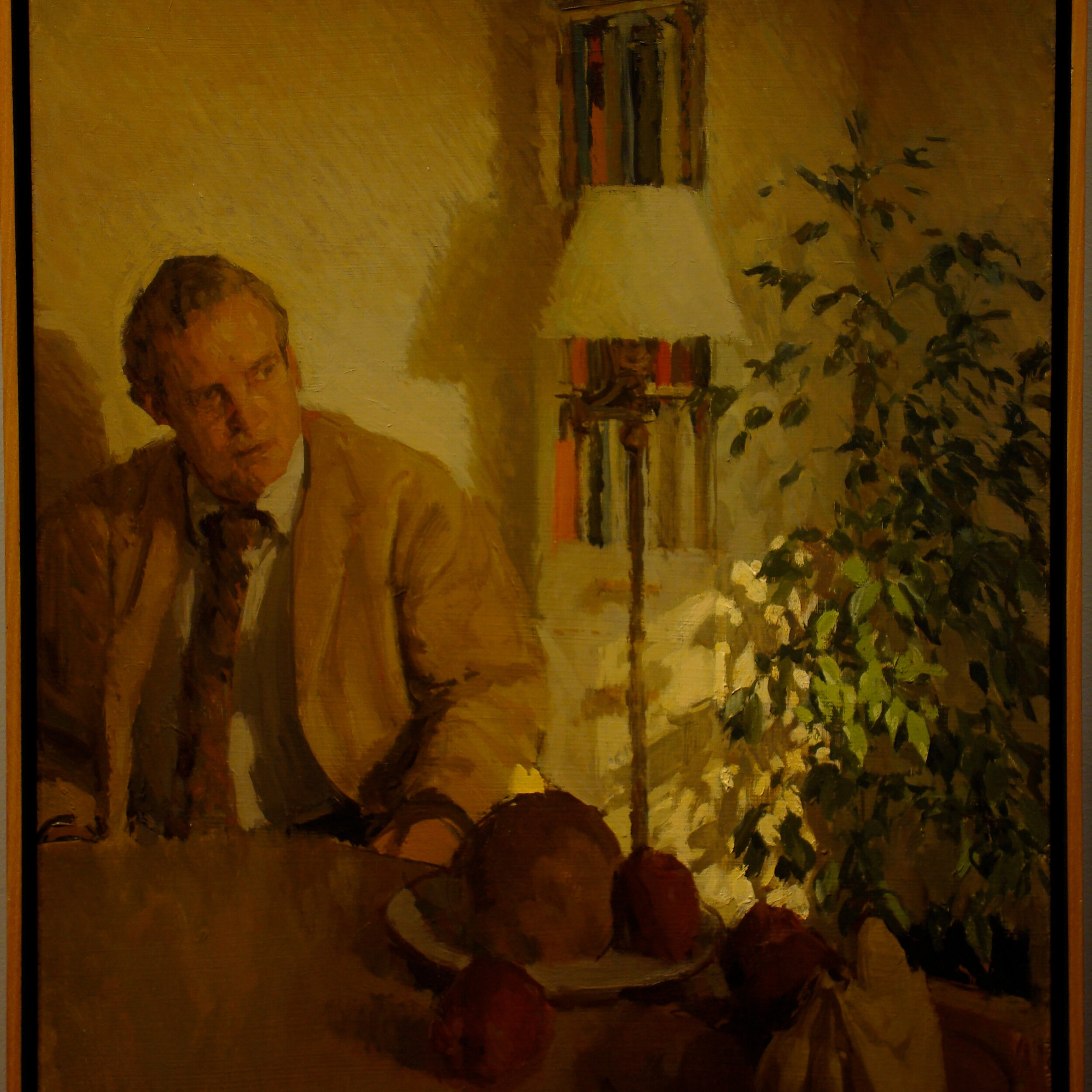
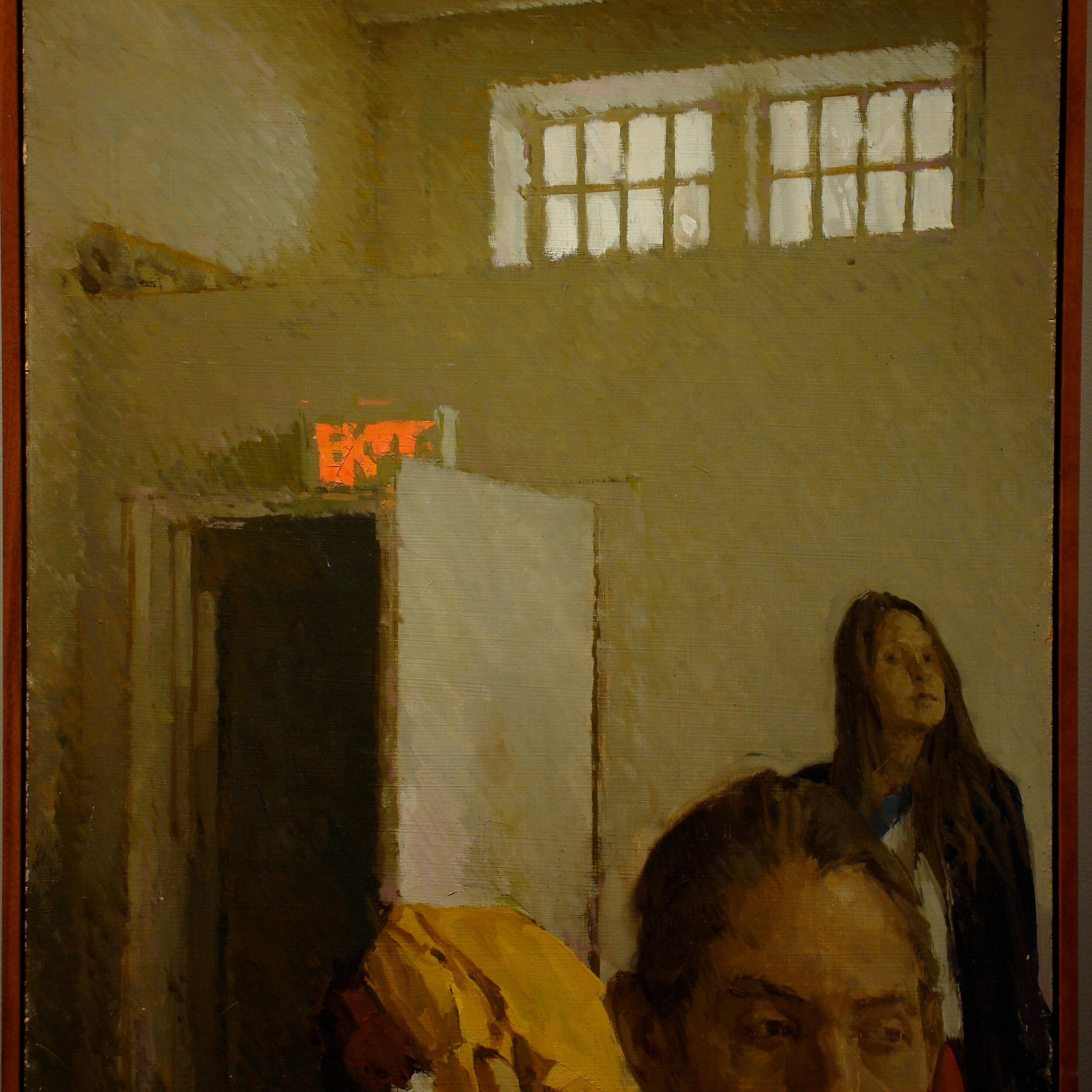
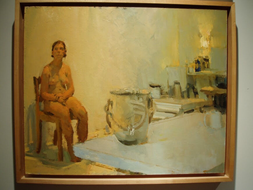
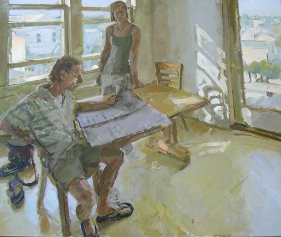
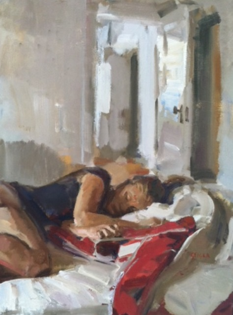
I first met Phil Geiger 5 years ago through my wife Anna Fox Ryan. She grew up in Charlottesville, Va. where Phil lives, works, and Chairs the Painting Department at the University of Virginia. If you see a teenage girl sitting in a chair or sleeping on a couch in one of his paintings around 2001-2005, chances are that was Anna. I had just begun painting and she said that I must see his work. On a visit back to C'ville we met him for coffee and a studio visit. What can I say? Meeting Phil and seeing his work completely changed to way I related to painting. Philip Geiger earned his BFA from Washington University and went on to complete his MFA at Yale University. Geiger’s lustrous light, loose brushwork and subtle color tellingly capture the nuances of mood and feeling that make up the more peaceful moments of contemporary family life. Geiger eschews a specific narrative in his paintings, challenging viewers to meditate on our society's daily rituals and settings, and the meanings which may underlie seemingly mundane moments. His work has been reviewed in the New York Times, Art in America, Artnews, and the New Criterion. You can find his work at Tibor de Nagy, Hacket-Freedman, and Hidell Brooks galleries.
I was talking to Phil about doing an interview for this blog and he had the idea to use a compilation of quotes from his class at UVA. His student Alison Penning put together this kind of "Geiger on Painting" that I have found very inspiring. Thank you to both Phil and Alison for allowing me to share this with you all. I hope you enjoy it!
SHAPELIFE - by Alison Penning , May 3, 2013
"Look for situations where there’s a clear light progress.”
"Choose the right subject matter. What is this little—pitcher? The pitcher begs the question: what is held? You found a beautiful disappearingness in that edge. Sometimes not seeing the thing is more compelling than the thing itself. Why those jars? Why that arrangement? What is compelling about the situation you’ve chosen to depict? What can you make compelling? See how, from this angle, the light fills the hollow of the eye? What naturally occurring element can you exploit and expand upon? Where do the characters, the figures, the objects throw shadows? Where do they absorb each other? Those places of overlap—see how those jars mimic bodies? What other objects/elements are drawn into the initial object’s orbit, altered or absorbed by the shadow? Choose situations in which a strong light statement reveals new information about a familiar object/person/space. See how, if you put the light above, if you paint looking down, the figure has the feeling of a supplicant? See how the figure bursts into the frame? See the hand on the breast? Is it tender? Or groping? See the sink? See what a difference the light makes? The most mundane subject matter can become interesting, in the right light and in the hands of the right artist. The encyclopedic nature of the contents of the closet…this becomes the subject matter. What is that—thing? I can’t entirely tell. But the color is gorgeous. The unorganized objects become organized by their inclusion, by the artists’ decision of their worthiness. The objects become organized by the system of light and dark, become interesting, infinitely interesting. Or finitely."
"See how that shadow, underneath, ties the figure to the ground? That shadow on the edge of the breast, the green one—that has a mood."
“Where’s the light source? Is it lit cool or lit hot?”
"The way light is thrown on a thing can be a powerful way of organizing the work, can be a powerful way to set a certain mood."
“Euan Uglow would paint the empty tabletop.”
"Every piece does not have to be every thing, contain all things. Avoid clutter. A painting is like a scene, a single moment under intense observation. What you don’t include is as important, or more important, than what you do include. The pillow with the dent in it suggests a head. The shoe with a panting tongue? Suggests a foot. Don’t try to make any piece do too much. Or, if you want a piece to overflow—if you want it to be disorientingly distracting—do that and mostly that; but do it with intention. Hide a harmony in the chaos. This may take many revisions."
“Be always drawing. Maintain a drawing practice.”
“Inspiration exists, but it has to find you working.” Picasso said that. Picasso was right about that, but isn’t always right. Listen to Picasso, but only when he’s good for you. Picasso called Bonnard “a piddler.” In a Bonnard (Picasso said) “you never once get the big clash of the cymbals.” Cymbals are nice, but not necessary. There are other noises a piece of paper can make. Cymbals come from color and contrast. Crispness. The clang of surprise. But you can’t deny the beauty of that woman in the bath. Bonnard’s wife, Marthe. No cymbals needed. Just the cool drip from the tap. The head about to slip under. Bonnard maintained a regular drawing practice. Draw women, warming up or cooling off in a bath. Is it lit warm or cool? Time spent studying the figure is always time well-spent."
"Your figures diminish as the eye moves to the edges, to the feet, to the fingertips. This doesn’t seem—is it?—intentional. A woman needs legs large enough and long enough and strong enough to walk on. An arm with the muscles to throw with. A hand big enough to palm the face, palm a mango, palm—whatever she wants."
“Limitations are opportunities.”
"If you’re given a double-square, use the length. Restrictions are not always comfortable, but can be useful. Subject yourself."
“Different-size projects require different tools.”
"No one should be using a teeny-tiny painting knife. We need more than a teeny-tiny taste of butter, here. We require more than one teeny-tiny drop of blood."
“Stop and make a five-minute drawing.”
"Once you go big, you’ll feel committed. You’ll feel tied to your decision. Or bound by it. If you make it largely gold, you’ll resist the need, later, to make it to green. It will need to be green, though. Let’s not get ahead of ourselves; this gold-to-green has to do with evolution, with revision. But why not plan ahead to save yourself from frustration? Make the five-minute drawing. Make ten of them. Make a careful study, if you’re worried about wasting time and materials. If you have limited resources, if you have a commitment problem—or if your commitment problem is that you overcommit—make your decisions on the smaller scale. Realize, sooner, that it needs to be green. Or black. Make a number of small, fast paintings. Small studies and exercises are crucial. Tests. A five-minute problem is better than a five-hour problem. A five-minute solution is worth more than the five minutes you spent."
“Yes, it’s a person. But in relationship to what? In what space?”
“How much floor? How much door?”
"The artist gets to decide, gets to subjugate the subject matter to his or her own project. What would Vermeer do? Vermeer would see the rectangles in the room—the window, the doorframe, the bed, the book, the tiles, the space between the legs of the chair—and Vermeer would rearrange them. Vermeer would create a quiet harmony, a musicality out of the rectangles. If the doorframe is almost parallel to the edge of the picture plane, make it exactly parallel. This is not meddling with truth. This is artistic intentionality. Decorative patterns, musicality, and rhythm—these can be ways of organizing. Let the eye move from basin to basin to sink to round face in the mirror. Let the circles cascade, like a bouncing ball. Think, “Nude Descending a Staircase.” Think of the wasted centeredness, the aloneness of a Giacommetti drawing. Think, how much floor? How much wall? Think unendingness, if that’s the point. Think bleak landscape. Or put a door in. How much door? And does the figure move toward? Or stay in place, despite it?"
“Keep track of the whole.”
“What is the biggest zone?”
“What is the dominant color?”
“What is the shapelife of the work?”
"Don’t be so obsessed with detail. Don’t make this corner perfect, and neglect the space. Don’t obsess over the face. The work has to work from far away; step back and assess. The work should have an allover quality; a harmony. I look at the hand and think, “This is highly detailed, is trying to be realistic. Is trying to capture a likeness.” I look at the drapery, at the bed and think, “It’s like your neighbor came in.” There’s a point at which inconsistency is going to make the viewer say, “Forget it.” I can’t understand the hand, if it’s not part of a larger system. If you squint, do the shapes still tell a story? Do they belong together? Block in the big shapes. Do it fast. Keep it thin, keep it loose. It’s too early to get heavy and obsessive. Obsessive rhymes with oppressive. That’s not the kind of rhyme you want. That’s art school amateur."
“What’s happening with those legs? Your figures have a thinness to them. See how her shoulders should be broader, here? See how she needs about twice as much arm?”
“Today, work on anything but the figure.”
"Look beyond the body. Find the light, there. Paint the tree."
“Cezanne draws anything but the thing, draws around it.”
"Consider the negative space; what’s said and isn’t said."
“Where are the lost edges?”
"What is the light and dark shapelife of the work? Where does the silhouette of one object dissolve, merge into the silhouette of another object? Cultivate an independence from the way things look. Ask what is chair about the chair, yes. But also: where can the shapelife of the work intrude upon the chairness? How can the lostness of the chairness teach us about the chair? How can the lostness of the body in the chair teach us about the body? Where do they merge? Think about cast shadows, and how they swallow detail. This creates the effect of groundedness. Or stuckness. The absorbingness of that shadow. The beauty in the black hole of the work."
“What is the speed of reading, here? Would you back up and come closer? Does it work from different distances, or only one angle?”
“Avoid art school muddiness.”
“Practice an economy of marks.”
"A slash of red, here, is enough. Don’t do something twice unless you want to do it three times, unless you want to make it a motif."
“You can’t make a painting without using paint. Give up on the economy of it.”
"You have to spend. You need material to make. There’s waste involved, and mistakes; and that’s going to hurt. Throw those pages out. No. File them away. It will be useful, later, to see how far you’ve come."
“Is there a mixedness to the color? Or is it straight from the tube? Mars Violet? Ultramarine (Green Shade)? Don’t just mix black in to make darks. Don’t mix white in for light. Work in nuance, work in side-by-sideness. Work-in the surprising patch of poetry. You need six workhorse passages for every passage of poetry. Workhorse can be poetry of a different kind. Workhorse can be the steadying brown. Workhorse can be the reminder that all bodies need food. Workhorse can be the bottle on the table, the empty plate, the curtain pulled across the window, the cracked nail of the big toe, the hobnail boot. The curly leather laces of a Van Gogh boot. Workhorse can be a horse, large-nostrilled and long-planed and fly-eyed. There’s a poetry to the workhorse, the tugboat, to Ajax and Achilles playing chess on the workhorse wine jug. To the piles of paint under the easel, the paper that will never see museum walls, will never be read. Workhorse can be the sweat and sand mixed into the paint. The fly, stuck in a black passage of One: Number 31, 1950. Is there a mixedness?"
"When you mixed, did you make something better? Or did you make mud? Mix carefully."
“If we took this red off the painting and put it on the wall, we would not find it a very remarkable red.”
"Everything is relative to the whole. Anything can be beautiful under the right circumstances. Or ugly. Put your eye on the lit zone while you’re mixing the shadow. Make sure they coordinate, exist in a balance."
“You’re working hard, but it’s not working yet.”
“Let every color be a color.”
"And that means, don’t muddle. Stop meddling. Learn to leave well enough alone. Let green be green, orange be orange. Next to each other, they vibrate. Muddled? They go brown. Leave clear divisions. Save some, apart from the other. Think Venn diagram. Think overlappingness. Think about the color that expresses the overlap. Think. Time spent off the page is well-spent."
“Graduate from photos.”
"Maybe you have an idea. Maybe you got it from a photo in a magazine. But trying to replicate something the machine saw—trying to execute some plan pre-charted—this will snuff the spontaneity. This will make it look like the making was mere executing. The work will read as something executed, as something dead."
“Set up a system—so that when you break from the system, there’s an element of surprise. A clean edge, but not straight. Get away from ruleredness. Find the edge that feels felt and examined. If everything else is cool, a single passage of warmth stands out. The value of surprise. Unexpected flowers. Reverse the central and periphery expectation. Celebrate singular shapes, shapes that are beautiful for their unrepeatedness.”
“This painting reads: loneliness, upsetness. You’re getting into a sort of depressing zone of color.”
“Where did the assertiveness go?”
“Be—make—alla prima.”
"Sit down. Do it in one go. Don’t plan too much of tomorrow’s work. If you do today’s work properly, your project for tomorrow might change."
“The power of just one orthogonal.”
"It can come from anywhere. It will break the fixedness."
“Extrapolate beyond the frame.”
"Is the piece self-contained? Or is it meant to spread out in all directions? Is it accidentally spreading? Rein it in by paying close attention to the edges, to the end."
“Make everything in the painting important, not just the figure. I’ve already told you this."
“Use the edges.”
“Find intentionality in the corners.”
“Rewards reside in decisiveness. Readymade decision feels hollow.”
"Decide when it stops."
“We all know that feeling. The excitement of making. To do the work, you have to be in kind of a pumped-up state. Then there’s the waking up the next day. The—well, the emotions you feel the next day. They can be bad. It’s part of the process. Know when to shut out judgment.”
“Everybody runs into a brick wall, as an artist, just pulling out of your own brain. When you’re stuck, look at great art.”
"What can we learn from the fanciful rockscapes of Giotto? From 1906 Picasso? The rocks create a carefully considered edge, a lively edge. They pass—measure it—through the precise center of the painting. They end precisely in the corner. Did Giotto really see this landscape? Or did he twist what was true, make it fit to meet his needs? Try making a translation. Picasso making a kind of graphic dark/light language. Bonnard constantly adjusting, a micro-based sensitivity. Make an interpretive copy of a masterwork. Slide your knife along the edge of that tub. Build a figure, there. How is the piece composed? Where is it alive? How are the edges handled? How are the hands? See the hand, reaching down from the sky? Did you notice the hand, before you started really looking?"
“When you’re stuck, look to nature. Look to the world. The beautiful thing about the world is its organicness. It’s impossible to replicate—so you have to invent. You have to invent ways around your inability to create in the same ways that God did."
“Let’s talk about problems of revision and overworking. Sometimes it’s broken. Sometimes you broke it. If it’s good, leave it alone.”
“Where is this supposed to end, and why there?”
“Finish it. Cover up the white.”
“Get to a place where each piece is less and less precious.”
"There’s a place where the broken ones cost less, and the working ones work better. Believe in the place. And believe me: it requires real work to get there. You have to be a workhorse. It’s a lifetime. Not a sprint."
“There is something to learn from every experiment. You’re experimenting. That’s just where you are.”
“This piece has an oppressive finishedness to it.”
“Make another one.”
“Know when to stop.”
“Does it reward close looking?”
“Does it look good, from far away?”
“Who is the audience, for a piece like this?”
“Is there an audience beyond yourself? (Not that there has to be.)”
“Cover up the white.”
“This painting reads: one night, one body, four forced blooms trying to make happy. Make happiness of the stripes. Making happy, more or less. In a small space. In a loud way. This painting certainly reads: I will be bright. In a two-cups-in, no-sedatives-tonight, two-Great-Gatsbys-looping-in-the-background, ex-boyfriend’s-mother-sounding-exactly-like-audiobook-Myrtle, deadline-in-the-morning-and-Nick-Carraway-whispering-under-the-scraping-of-the-paint-knife, is-Nick-gay-haven’t-read-this-since-eleventh-grade, almost-summer-and-almost-okay-in-the-aloneness-of-the-long-creating-night kind of way.”
"Nick Carraway in the ear, narrating the allure, the confusingness of excess. Narrating beauty; crumbling filling stations; great, misplaced risks and diminishing returns."
"The painting ended up more garish-party, more blue gardens men and girls came and went like moths among the whispering and champagne, more station wagon scampered like a brisk yellow bug, more every Friday five crates of oranges and lemons arrived from a fruiterer in New York—every Monday these same oranges and lemons left his back door in a pyramid of pulpless halves. Every weekend, the florist arranged expensive floral arrangements, snapdragons, thistle—when a buttercup would do just as well. Might do better."
"The grapefruit is the most successful passage. This interplay of cast shadows? That’s a successful passage. Gray next to yellow. That works. You might think it wouldn’t. You surprised yourself, there. Ok. Where’s the next one?"
“Use the tool to make a shape in the paint.”
“Carve in the planes of light.”
“There’s a specificness and a curliness and a bunched-back-ness to the hair.”
“Make sure the shapelife of the work is stated in strong terms.”
“The green light, here—”
“The disappearingness. Boldness hand-in-hand with precision. An erraticness, a littleness next to this overwhelmingly feminine bigness shapeness. Look at this painting of a horse. This painting was painted before the advent of the photograph. Before Muybridge’s galloping jockeys; before the photo that showed the horse with all four legs off the ground, all at once. (Those four legs off the ground like a bug’s legs; those four legs enclosing a rectangle.) This painting was painted before that photograph. But the horseness is there. And the movingness. And the runningness. The decisiveness.”
“The cube is handled with great confidence.”
“The values on the torso are close; and the closeness is beautiful. This decisive line, the backwardness—this is beautiful. When you mix something really dark, still ask yourself, what color is this? There’s a habitualness of our palettes, when we use brushes, when we don’t clean our brushes. Make clean marks. Try limiting yourself; use six piles. Two reds. Two yellows. Two blues. You broke the rules, there; but you did it with intention. There’s a relaxedness to the gesture, a grace of hands. A luminous wholeness, to that one. An airiness. There’s too much air between the patches of color. The white space, here, makes the viewer too aware of the ground.”
“It’s quite a difficult thing.”
“There’s a noticedness to the objects.”
“Finish it.”
“There’s a jewel-likeness, here.”
“How is the material fitted to the rectangle? This edge feels utilized.”
"I can’t quite read it, yet; but I know this is important."
“Make another one.”
“Shapelife.”
“Cover up the white.”
The white the white the
